Deezer is a music streaming site that is a competitor of Youtube Music and Spotify. The problem is that Deezer isn’t very well designed. Their website and app looks very amateurish compared to their competitors, which makes it a struggle to attract new customers. Which is a shame, because Deezer offers good features for free like High Fidelity music.
Original Website
The original website had a very cartoonish bubbly look to it, which makes it look childish and aimed at a different demographic than what its going for. Compared to their competitors they seem like the odd one out, in a bad way. Also they ordered the information in a bad way which caused a lot of their features to be buried, when they should be stand out features.
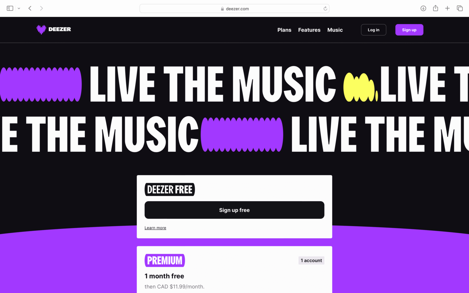
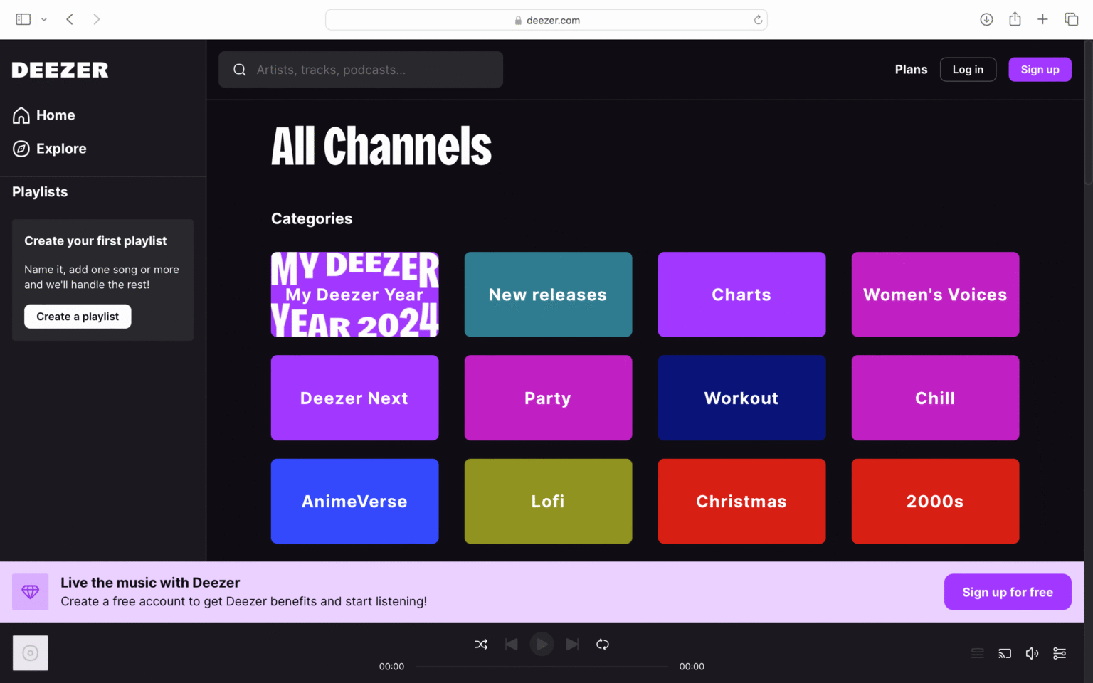
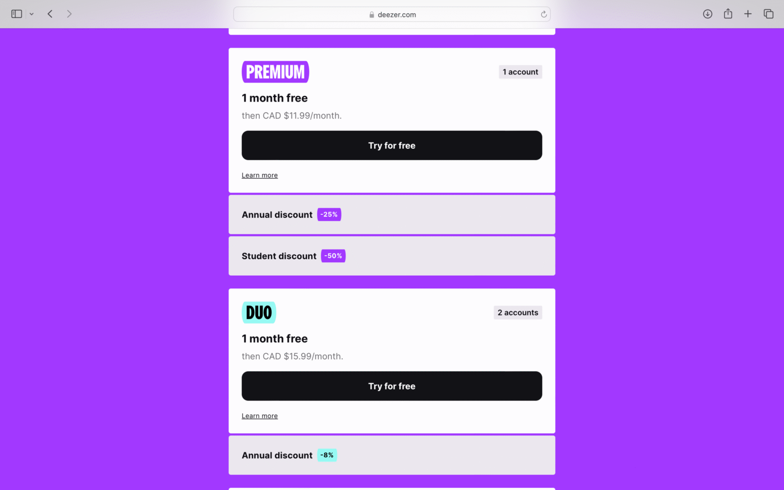
Redesign
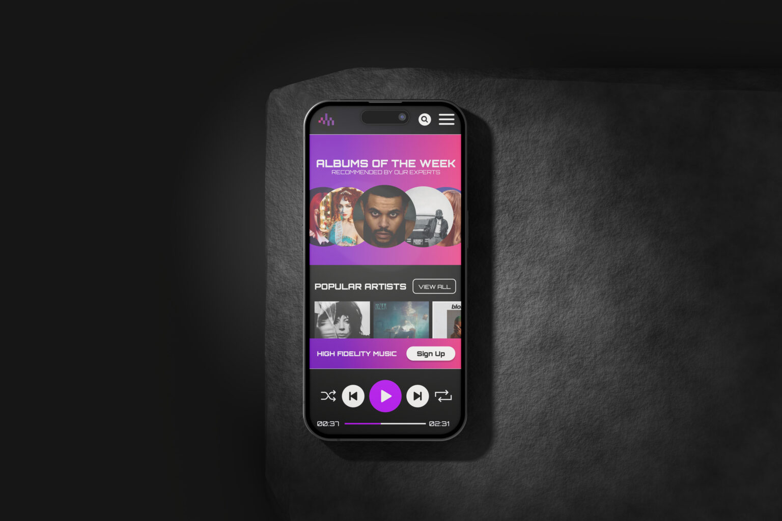
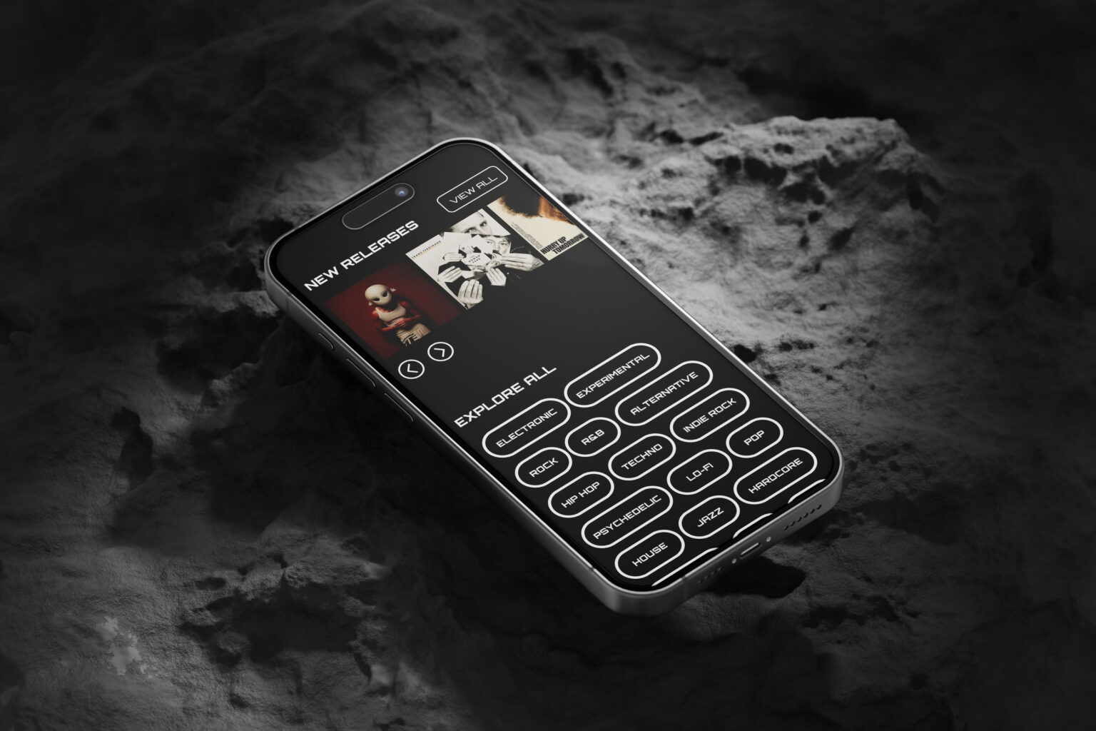
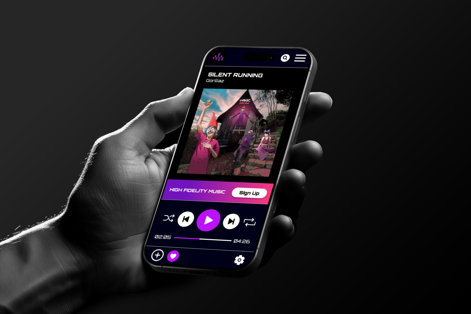
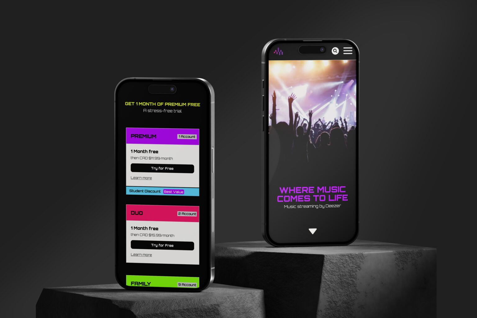
Redesigning the website I set up some priorities. First was reorganizing the information so the most important information was easily accessible. Second was compare and contrast what their competitors did and last but not least is redesign their style to fit more to their demographic. For the homepage I decided to make it the music page for efficiency and then I added the “High Fidelity Music” as a pop up followed by a “Sign Up” button streamlining the most important information.